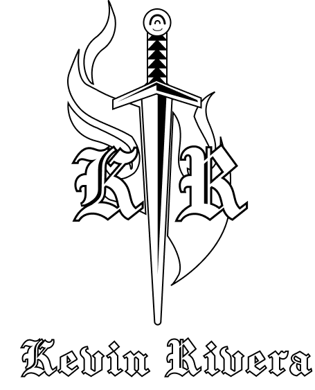
Graphic Designer
"Passion, Ideation and Vision"
Hello, Im Kevin! Otherwise known as PapaLupo on most of my handles. I am a 27 your old designer, Graduated Valencia College and I live in Florida while working as a freelance graphic designer.I like Videogames (Mostly TTRPG's) and Dungeons and dragons.

I have a penchant for conceptualization, with a focus on efficiency. I am experienced, and practiced in both print and web design as well as coordination and communication with clients and other designers, whether delivering single or multiple works.I am proficient in various programs within the Adobe creative suite, such as Photoshop, Illustrator, After Effects and Indesign.I also have experience with other programs such as Inkscape, Gimp and Figma.
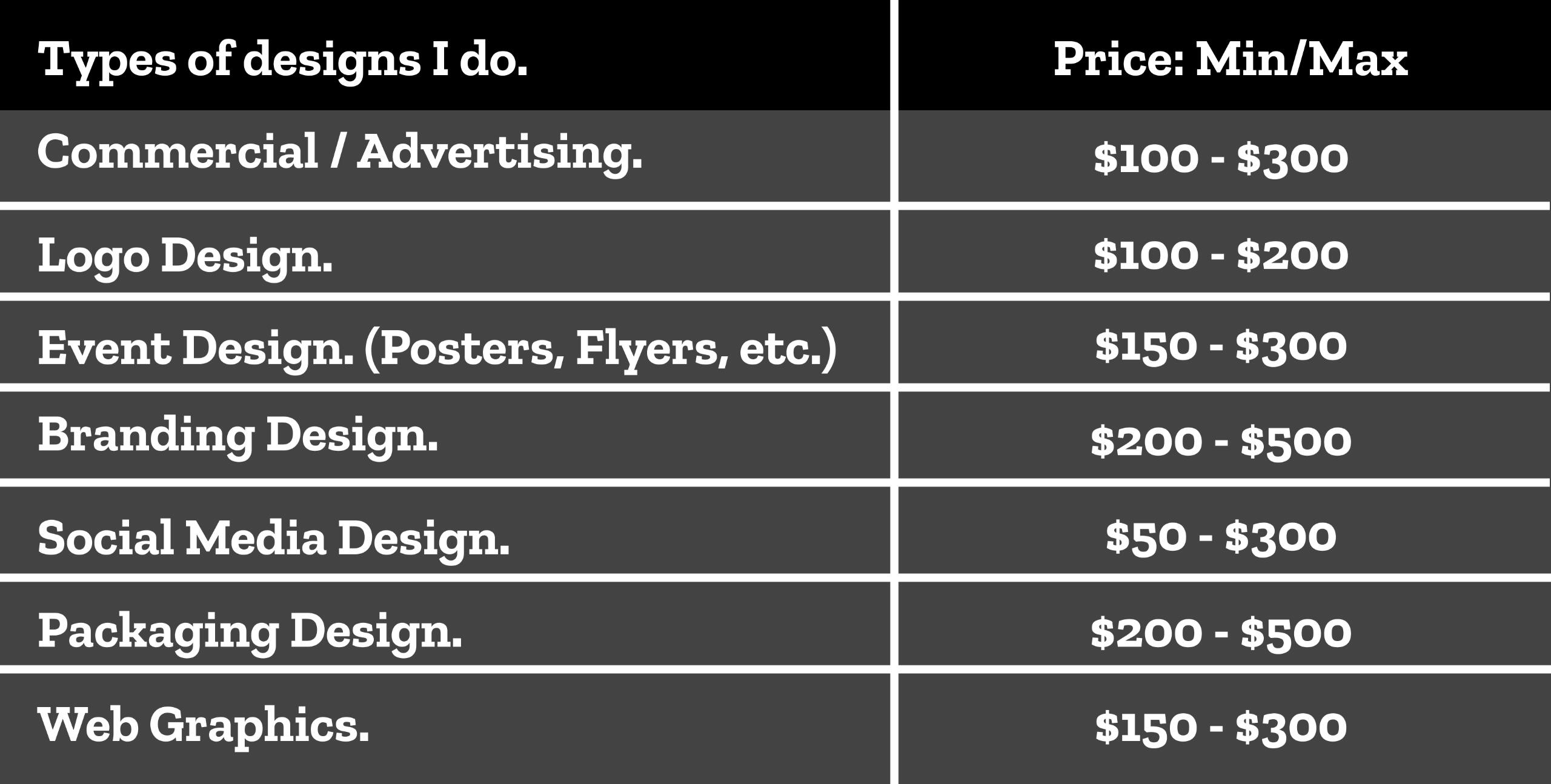
Skills:
- Logo design.
- Poster design
- Branding design.
- UI/UX.
- Publication Design.
- Video editing.


Terms & Conditions
General:
· When ordering a commission, it is assumed that you have accepted the terms of service. Please read them carefully!
· The work is for personal use, unless it has been agreed that the type of commission would be commercial.
· You can show my work on external platforms as long as an accreditation linked to me is visible, give credit where credit is due.
· The rights to modify the graphics are reserved as long as it is for personal use.
· Violations of the terms will leave the client blacklisted.
· If you have any questions, feel free to contact me!
Copyright Info:
I, as the designer. maintain the rights to:
• Post the commissioned work on social media as promotional artwork.
• Publish the commissioned work on my portfolios.
Payment:• Payments via PayPal, Cashapp and or venmo.
• You, the client, are responsible of adding the PayPal fee.
• You can pay upfront at least 50% of the price upfront before I start.
• I will initiate the transaction to avoid accidental transactions. Do not send me any kind of payment until I have confirmed I can accept your commission AND have asked for payment.
• Repeated counts of commissioning a project and failing to pay will result in blacklisting after the project is done.
PAYPAL DISCLAIMER
• Nothing is ever intended by either me or the Client, to be physically shipped to them.
• I am not required ever to ship any item unless it was explicitly discussed.
REFUNDS
• I can refund 100% of the payment only if I have not started working on the project.
• Once I start the the revision process there will be NO REFUNDS.
• If I cancel a project, I will reimburse the lost fees and refund 100%.
Freelance Commissions
The Process• You must contact me either via Twitter, Instagram DMs or e-mail.
• Please make your request concisely worded with minimal abbreviations, so as to make the note clear to read.
• I'll start working once the payment is sent for at least 50%, we'll follow up with the pre-production part.
• A shared folder will be prepared to facilitate the transfer and storage of visual assets.
• Use the folder to send references, mood boards, and assets i should work with.
• I'll send different iterations and two proposals with a watermark to the drive folder.
• Up to two major revisions can be made during the iteration phase of the commission. Only minor adjustments within reason can be made afterwards.
• The final product will be sent on a separated shared folder containing it's respective files.
• Current estimated time of delivery for regular commissions go from 2 weeks to 5 months, depending on the size of the project and position in the queue.
• Any file you acquired might be available from my end for a finite time only. I take measures to preserve most files, however, I cannot guarantee against computer/ cloud storage failure, accidental deletion or loss.
Rush Fees
• Estimated project start dates will be displayed on my schedule and stated during the contact stage of the process.
• However, in some cases, I am able to accept a rush commission that would bring your queue up forward significantly.
• Dates provided are subject to change, details are to be discussed should the client have set dates.
• Rush fees are at least + 25% of the commission. Fees might vary depending on the project and the timeframe provided.

Web Design Projects


Print Design Projects


Logo Designs


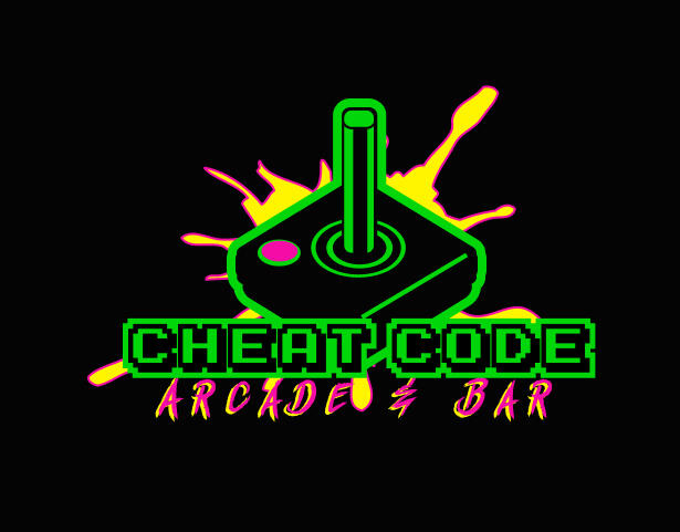
Arcade branding campaign. Made by Kevin Rivera
For the project we were required to add extra things and I decided to add two website layouts for the ad campaign.Most arcade sites ive seen tend to stick to darker neon backgrounds, its like you have a piece of the arcade right inside your computer.Whilst making these I took some time visit and spend time in an actual arcade to find some inspiration! To really capture that 90s retro arcade feel and to visualize myself on what designs I would see in an arcade as a customer.
Homepage & Gamepage.


Social media ads
Instagram Ads


Facebook Ads


Web mockups.


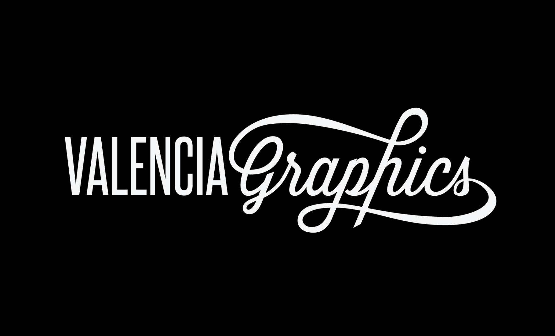
Valencia Graphics Website.
Made by: Kevin Rivera, Diego Rodriguez, Daniela Trujillo, Natalia Polanco, Luis Santiago.This was my last project for before I graduated. I worked with a larger team in a room full of graphic design professors, spit balling ideas on how the valencia graphics site can be re-designed. I mostly handled color variants of all the pages while Diego and Luis handled the prototyping. Daniela and Natalia Worked on structuring and hierarchy.Our color scheme had been decided on magenta, orange, purple and yellow. A striking combination that evoke a sense of opulence and exclusivity.
Webpages


A corporate business design project. Made by Kevin Rivera.
In most of my projects I have made as a student would often have to picture myself as the client and think what questions and or ideas they would have for a branding design for their business.So I decided that this would be a new branding launch for a corporate bank to gain some revenue.As I started working on this project I began to recall the patterns on banking letterheads and envelopes back when I went to banks with my parents as a kid.What stood out to me the most was the patterns used in their branding. I did some more research to gather more inspiration until I made a pattern of my own that would fit the aesthetic for a bank business.


Website pages.


Web Advertisements.


Instagram Mockups


Mobile Website.


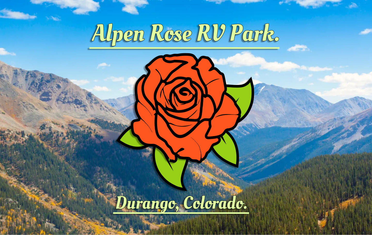
Alphen Rose RV Park Website. Made by Kevin Rivera
This was one of the first projects where I had to update an old website, The client for this assignment wanted an updated look to their site.
The logo for the site is based of an alpen rose flower, figured it be simple while contrasting with the woodland green color. The assignment aslo required to use the old images from their old website along with the rest of the content that was present.
Webpages.


Web Mockups


Volusia County Library website.
Project was made by: Kevin Rivera, Joshua Child and Alexa Vallenilla Ramirez.A group project assignment from one of my design classes, I worked with a team of three making website layouts for a library.It was the first project Ive ever worked with a team with. We planned to create our own wireframe drafts of this website and review what would work and what would not. We then looked to other library websites for colors and decided a tan color with green and white for a naturally sophisticated look. After making the designs we also had to prototype the pages with links so the buttons are accessible for clicking.
Webpages.


Mobile webpages.


Sitemap/Colorpallete.


Webpage Wireframes.


Mobile Site Wireframes.


Mobile Tablet Site Wireframes.


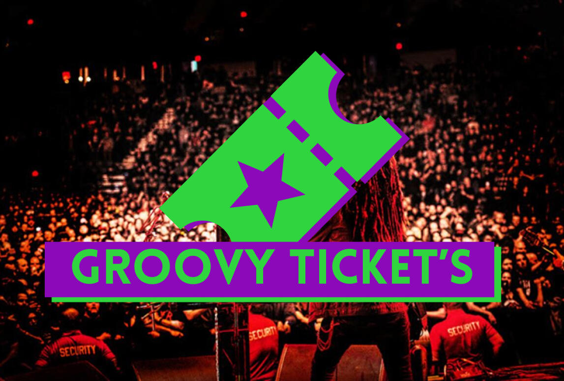
Mobile App project. Made by Kevin Rivera.
This was a project from my User Interface class and the first assignment of designing an app of my choosing. I came up with the name after listening to my playlist on spotify and got a notification on my phone about one of my favorite bands performing in the amway center, that is when the idea for an app to buy concert tickets came to be.
Client brief.
Joe Baxter is a Sales manager at a large tech company, during his time away from business trips in first class airlines, He enjoys rock music, partying and going to concerts, he plans to go to a concert with friends to see their favorite band, August burns red but Joey here is having trouble finding a simple and less complicated app to purchase concert tickets and quick because he doesn't want to miss the concert.Chris Wilson is a target employee who is a big fan of parkway drive and wants to bring his friends along to one of their concerts and wants an easy way to buy concert tickets as well. The Goals of this project is to make a successful handy app to purchase concert tickets, quick and easy with no hassles and no complications. The Design will have a color scheme of green, black, purple and grey to give it that cosmic exotic color along with simplistic icons to really match the feel with the concert images of crowds with their hands up high facing the stage which is what the site needs as of now. Here are the inspirations I've found for the app, in terms of color schemes and icons! My main inspiration for the color scheme was from a music app known as spotify and I thought it would look nice with the ticket icons making the app's logo a green ticket.


Mobile Webpages.


Web App mock ups


Nitro Gear blurb publication magazine. Made by Kevin Rivera.
This project was focused on putting together a magazine. Making a magazine for the first time was like a personal achievement to me and it was very fun to make.On the front cover here the theme of my magazine was a PC building magazine, showing guides to building your own PC and comparing computer parts from affordable to high quality.I felt the color palette signified royalty, luxury, nobility, power, and ambition. Something that can be related to PC gaming and having a powerful computer.The advertisements are custom made. I remember seeing adverts for some of these brands in best buy magazines and posters. My memory of them provided a good guideline for putting these together.
Front & Back Covers


Table of contents, Splash section page, Contributors page, BOB section page.


Advertisement pages.


Department Pages.


Feature Pages.


Printed magazine (Blurb)


Valencia college: Juried student art exhibition poster Ad 2024.Made by Kevin Rivera.This was a poster project for one of my design classes, I experimented with filters and grunge textures to see what I can put together. The primary colors on the page really made the red parts of this poster pop while the textures brought it all together. I used a noise filter with a paper texture though the white tear in-between was pen-tooled from a picture of a piece of printing paper I ripped apart.


A sticker box layout and folder design that is D&D themed.Another assignment project where we design and print our own box and folder of our choosing. I decided to chose a DnD sticker box.During that time I was with friends playing DnD while we waited for our classes, serving a fun little inspiration for a project.While I wanted the box design to be simple and sweet with the black color making the stickers pop on the front and back of the box. I wanted to make the folder different while retaining the fiery colors of the fire on the front of the box, I went with dragon scales instead, scales that resemble a fire dragon.


Survival Hacks survival guide magazine.one of my projects for my digital publication class in college. The assignment was to chose any book or magazine and re-design it. I chose a wilderness survival guide.At the time I was watching flicks like the walking dead which served as inspiration for this project.Used a woodland color scheme to fit the theme of the topic. I also wanted the covers to look like something found in a library or one of those scholastic fairs in grade school. I used diagrams and images for each section, keeping the top and bottom parts of the pages a woodland brown to make the contents in the bodies of the pages stand out more.
Front & Back Covers


Pages.


American Lung Association poster design
This was one of my assignments in advanced graphic design class 1 during my sophomore year in college.This project reminded me of all those anti-smoking commercials on tv as a kid. The lungs are like trees, smoke a cigarette and you start a forest fire.


Arcade branding campaign (print)
Made by Kevin rivera
This project was the second branding campaign I've done and being a big nerd, i really liked the arcade theme and aesthetic so I knew i was gunna have so much fun with this.My thought process on what the client of this company wanted was more revenue for this ad campaign, I did some research going to a local arcade and getting a feel of the atmosphere before I got home putting these together.I was leaning toward the traditional 70's - 80's retro arcade style. While I was at the arcade I took a few pictures and decided on having green, magenta and yellow as the color palette.It was a little tough to come up with a logo because there was so much i could do, I asked my peers from class and the vote led down to the joystick.The images I decided to use were the elements of what you would normally see in an arcade. Neon lights, arcade game machines and the retro arcade carpet pattern.
Business & Arcade Game Cards


Food Menu


Window signage poster ad.

Magazine ads.


Print Mockups.


A corporate business design project (print)
Made by Kevin Rivera.
This was a project for my advanced graphic design class in college where we have to design our own corporate business. I decided to design one for a bank.I always had a liking toward corporate bank patterns on their envelopes and cover letters, Very minimalistic yet aesthetically pleasing. The main logo it self representing the flow of financial interest or the amount of earning more through APR percentages rates.The most fun I had designing this was the brochure, I had plenty of room to work with adding corporate pattens in the background the geometric shapes and lines where the folds would be on the tri fold brochure.
Magazine Advertisements.


Tri-fold Brochure

Business Cards, Credit Cards & Employee Badge.


Letterhead & Envelope.


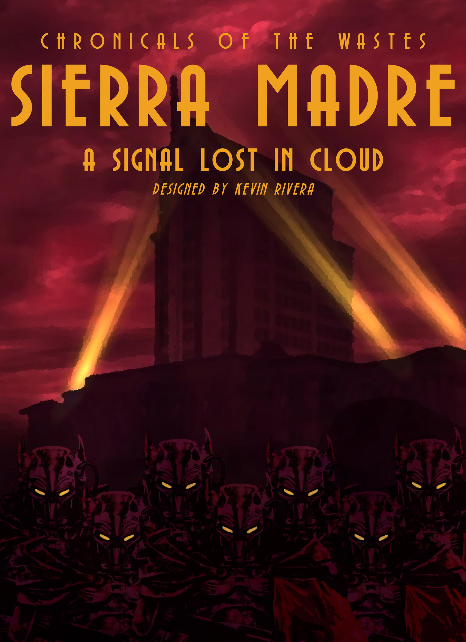
Fallout Sierra Madre Poster design
Came up with this one since my favorite gaming franchise is Fallout and I wanted to make a poster that resembled the game.I sufed the web for every font within every fallout game to find the seirra madre font. I also used an oil filter on the picture of the casino from the games DLC. As for the power armored figures below, I had to mask them and change their hues to match the atmosphere of the background.
Business email: [email protected]